The KLV Copywriting Blog
The best branding tells the story of the people, values, and purpose behind the business. I knew if I wanted branding that would properly showcase who I am and how I run my business, I would need to bring in a professional.
That’s where The Brand Anthropologist came in.
I collaborated with Emma of The Brand Anthropologist to take my chaotic collection of inspiration pictures and a few budding ideas into the beautifully depictive branding and website you see today.

Every font, color, and element that went into each version of my logo has a purpose and a meaning behind it. Let’s look at each one below.
With a Human Touch
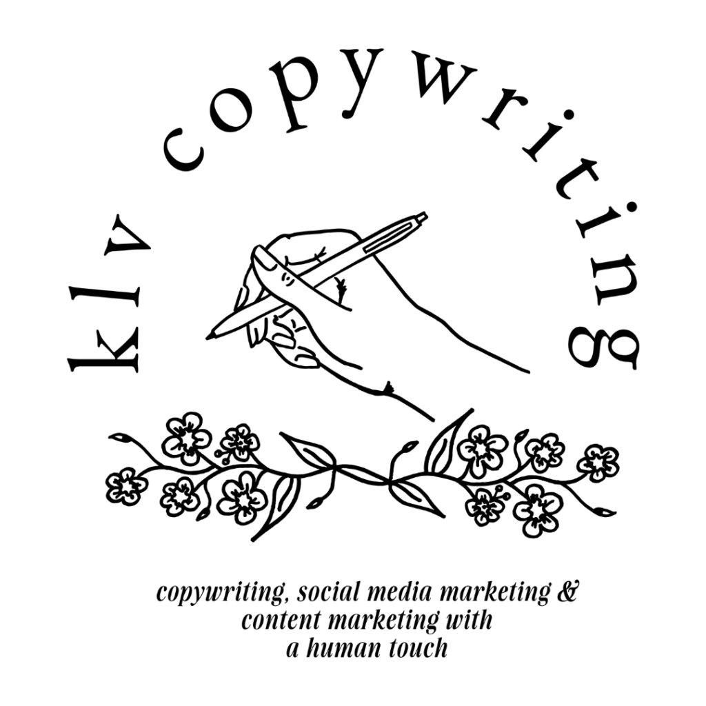
In the same way that I prioritize the human element of my writing (meaning no AI), each element of my branding was drawn by hand before being turned into a vector.
That’s right–every bird, flower, and illustrative element you see in my branding was drawn by hand!
Authenticity is what I aim to provide my clients on every project, and the underlying human elements throughout my branding are a representation of that. There’s a human touch in my writing, and there’s a human touch in my branding, too!
Human Connection
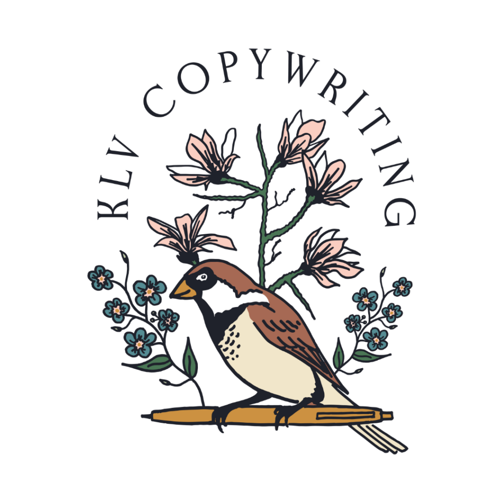
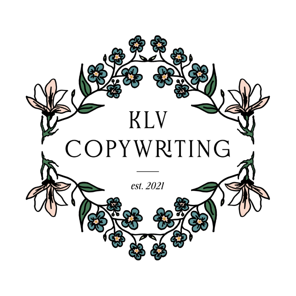
The flowers you see in my logo are magnolias and forget-me-nots. While they do make a beautiful addition to the bird in their shades of pink and blue, they also serve a purpose: both flowers represent the connections I create with my clients and the connections I help my clients build with their audiences.

Creativity is a Priority, Always
Now, onto the star of the show: the bird!
The bird you see throughout the different versions of my logo is a sparrow. This bird represents connection, creativity, intelligence, and ingenuity, which are what I strive to give my clients every time I deliver a project.
My experience as a writer is directly referenced by the sparrow’s perched placement on the pen.
An Inspired Font
When compiling my brand inspiration board to give Emma an idea of the direction I wanted to go in, I pinned several apothecary labels and classic books with serif fonts. Based on these inspiration pictures, she chose the font Gyroscope for my logo. It’s clean and easy to read while still referencing the fonts from my inspiration board.

The Story of KLV Copywriting
There you have it, the story of my branding!
I was so appreciative of the authentic representation of my business that I did cry out of genuine excitement when my branding was first presented to me. (I’m not the only client of Emma’s who has cried when she presented their branding to them!)
Every time I use one of my branding elements, I am beautifully reminded of the purpose behind what I do.
Leave a Reply Cancel reply
© 2023 KLV Copywriting
Website Design by EMARIE DESIGN
Founder of KLV Copywriting, specializing in copywriting, social media marketing, and content marketing with a human touch
